How To Create Media Queries In Responsive Web Design?
Posted on June 29, 2021 by leapoffaithtech
As the usage of hand-held electronic appliances is increasing day by day, it has become mandatory for online businesses to make their websites compatible with different devices. We all know how important it is to create sites that can work on numerous interfaces. The procedure of a website to adapt to the user’s design is called responsive web design. These websites that can work properly on different devices are known as responsive websites.
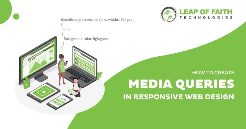
However, the responsive design of a website comes up with several challenges of its own. The problem of slow-loading sites is well-known to all of us. Let’s run through an important technique designers use to properly load content and photographs on various computers. It is the usage of media queries used to call styles to a user device depending on its dimensions. There has been some discussion in the past regarding whether these media queries are the right option or not. The creation of media queries is an easier and more effective way to serve different content across various platforms, and perhaps the most widely used queries would be those that deal with the width and height of the viewport.
Method of Creating a Media Query
It is the @media rule, which is usually used by different media devices to apply different styles. For instance, the media type such as screen, print, or speech implies that certain styles are used only for printed documents or screen readers. Apart from the media types, there are also many other media features that you will find. Using media queries helps you keep a check on several things. Some of them we have listed below for you
- Width and height
- Usage of Pointing Devices
- Orientation (whether it will be used on mobile or laptop)
Let us now briefly help you understand the media mentioned above feature rules. You will often find them used during your web design creation.
Width And Height
The feature you will usually see being used more frequently to build responsive websites will be the viewport. You can prefer using the CSS if the viewport is more than or below a particular width. The media queries used for them are min-width, width, and max-width. These functionalities are used to build interfaces that adapt to various sizes of the computer. For starters, if the viewport is exactly 700 pixels, use the mentioned media query to alter the body text color scheme to blue.
@media screen and (width: 700 px) {
body {
color: blue;
}
}
However, in practice, you will often see that the minimum and maximum values are used for a responsive design. Hence, it is very rare that you will see width and height alone.
@media screen and (max-width: 700 px) {
body {
color: blue;
}
}
Orientation
One of the well-supported media functionality is orientation. When you hire a web designer, they will always tell you about this feature because it helps you check for portrait or landscape mode. If the system is in landscape orientation, use the following media query to change the body text color.
@media screen and (orientation: landscape) {
body {
color: blue;
}
}
A traditional computer view has a landscape view, and a style that functions well in this orientation may not perform well when displayed on a phone or tablet in portrait mode. The orientation test will help you construct a style for devices showing the portrait mode.
Usage of Pointing Devices
The hover media feature has been introduced as part of Level 4 specs. A traditional computer view has a landscape view, and a style that functions well in this orientation may not perform well when displayed on a phone or tablet in portrait mode. The orientation test will help you construct a style for devices showing the portrait mode. This will greatly benefit if your user uses the website on a touchscreen device.
@media screen and (hover: hover) {
body {
color: blue;
}
}
Now that you know how to create the media queries for your responsive website, you must have realized what sort of things go behind a website that works properly. You can now certainly consider using a web developer’s help to create the queries for your website. Leap of Faith technologies are at your fingertips to help you make your site efficient and easy for visitors.
Categories


